Knoten Boards brand guide
The mark, the name, the colours, the type and the voice, drawn from the product's own tokens and brand files so they cannot go stale, with every file to take.
The idea
People who run AI agents cannot see what those agents are doing until they stop and ask. This product puts the work where it can be seen, as it happens: every agent writes to a board, and the cards move as the work moves.
So the brand has one idea: the one thing that just changed is the one that shows. The mark is glass that has been cut, where one facet catches the light. The brand has no hue at all, so that single filled facet is the only mass in the mark, and the accent is ink. The surface is quiet, white or near black, built from hairlines, and the site's main image is the real product running, never a picture of it.
What the brand never does
- No gradient, glow, glass or blur.
- No stock photos, illustrations or 3D.
- No icon-and-three-columns feature grid.
- No bento of empty cards.
- No mock terminal or video standing in for the product.
- No small label above a heading.
- No coloured stripe down the edge of a box.
- No centred body text.
The mark
A square with two unequal corners cut at 45 degrees and a smaller figure inside it. The unequal cuts make it asymmetric and ownable.
At each size, on light and dark grounds
Do not
The wordmark
The mark, then the name in capitals, set in Schibsted Grotesk at weight 500 with 0.187 em tracking (--track-wordmark), at 15 units beside a 32 unit mark with a 12 unit gap, its baseline 10.75 units above the mark's bottom edge. The lockup is drawn from the name, so a rename never needs a redraw.
Downloads
The mark

mark.svgSVG on a 32 unit grid. The mark for light grounds.

mark-dark.svgSVG on a 32 unit grid. The mark for dark grounds.

mark-mono.svgSVG in one colour (currentColor), for anywhere only one colour is possible.

mark-small.svgSVG without the facet lines, for below 32 px and for favicons: every edge lands on a whole pixel at 16, 32 and 48 px.

mark-dark-small.svgThe small mark in the dark ink, for dark grounds below 32 px.
The wordmark

wordmark.svgSVG, the mark then the name, for light grounds.

wordmark-dark.svgSVG, the mark then the name, for dark grounds.
The app icon and the share image
icon-512.pngPNG, 512 by 512 px. The app icon, the one place the mark sits in a container.
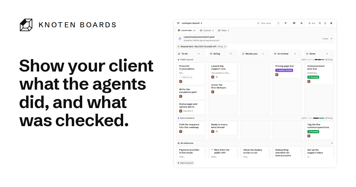
og.pngPNG, 1200 by 630 px. The card shown when a link to the site is shared.
Colour
The accent is ink on a white page and on the near black one, with a neutral ramp shared with the product; the site adds no colour of its own. Every token and its value in the current theme is on the design system page.
Ink marks a selection, a link, a live state and the mark's filled facet. The one primary action is filled with ink (--ink, with --bg text), so it reads the same in the product and on this site. Quiet marks (--ink-3) are for icons and large text only, never body text. Every contrast ratio is in the table below.
Green, amber, red and violet belong to the product's states (done, waiting, needs attention, a person's call) and appear on the site only inside the running product. Red is only ever for something that needs attention.
Three answers to an accent that is ink
Ink is the accent, so the jobs a hue would carry ("this is a link", "this is focused", "this is informational") each have their own token and none depends on a hue.
Read how the colours are measured before you change one.
--link, --link-line at --link-thick, thicker on hover and focus. An anchor with a class is a control and is not underlined.--focus, clear of the control by --ring-gap (2 px) so it stands apart from an ink selection border. Inside an ink surface such as the toast, --focus is that surface's on-colour.--i, --i-2, --i-t, --i-on), distinct from ink by shade. Wherever a tone is a dot, info is a ring and the state tones are filled, so it also differs by shape.Contrast, both themes
Each ratio is computed from the product's token file, and the lowest value across every surface the page can show is the one listed. The product's tests fail below the minimum.
Type
One family: Schibsted Grotesk, licensed under the SIL Open Font License 1.1 (the licence file ships beside the font), served from the product's own files as one Latin subset so every visitor sees the same face, with the system's interface face (--font) showing while it loads, and a monospace companion for commands (--mono). Weights 400 to 650 are served: body 400, interface 500, headings 600 to 650, the wordmark 500 in capitals.
Each size, weight, tracking and leading is on the design system page.
Headings balance their lines and running text wraps with text-wrap: pretty; text fills its column, with no width set in characters or pixels on a paragraph.
Voice
Plain, specific and calm, written to the person running the agents. Say what happens, in the order it happens. Give a number only when it was measured, and name where it was measured.
| Write | Never write |
|---|---|
| See what your agents are doing, as they do it. | Unlock real-time AI-powered visibility. |
| Your agent asks with a reason and a recommendation; you answer on the board, and the agent reads it the next time it checks its inbox. | Seamless human-in-the-loop collaboration. |
| Every change is kept, so you can compare any two versions word by word. | Never lose track of anything ever again! |
| It runs on your machine with Node 20 and no other dependencies. | Lightweight, blazing fast and developer friendly. |
Rules that hold everywhere
- Sentence case.
- No "we".
- No exclamation marks.
- No em or en dashes.
- No "AI-powered", "seamless", "unlock", "supercharge" or "next generation".
- No claim about competitors and no "the only".
- No invented customers, logos, quotes, counts or trial offers.
- Times carry their zone.
Words, one per idea
- board (a set of tabs)
- tab
- card
- column
- agent (software that writes to a board)
- person
- answer (what a person sends back to an agent)
- version and compare
- live (served from a machine and updating itself)
- file (the single HTML copy that keeps itself current)
- hosted (served for several people with their own access)
The product's interface calls agents and people together "drivers"; the site does not use that word.
Motion
The product's motion is the brand's motion, from the same tokens. Only the live dot loops. Everything else plays once, explains a change and never blocks input. Under reduced motion nothing slides or scales: a change cross-fades.
Every duration and easing is on the design system page.
The mark itself is still. It never animates, in the navigation bar or anywhere else.
Space and shape
Controls and fields take the small radius (--r-1), cards and panels --r-card, and frames around the product --frame-r. Every space step, radius and the site's rhythm is on the design system page.
Shadows sit only on floating layers (menus, sheets, toasts). Groups are made with space first, then a hairline, then a surface; a box is never nested in a box to make a subgroup.